Newspaper Ad
Job Specs:
Ad size- 7.71"x6" - .25" margin - No Bleed - Black and White
Formula:
4 colums wide = 7.71"
4x6" = 24
24 x $4 = $96
InDesign File Size - 7.71" x 6"
This assignment was to create a black and white newspaper ad based on the specifications for The Collegio. We were given column widths to choose from and we were to determine the height of the ad based on our budget of $100.
Columns Inches
1 1.83"
2 3.79"
3 5.75"
4 7.71"
5 9.67"
6 11.63"
I wanted to create a large ad to attempt to grab the attention of the reader before any other ad and also stay within my budget, so I chose to do an ad 4 colums wide and 6" high.
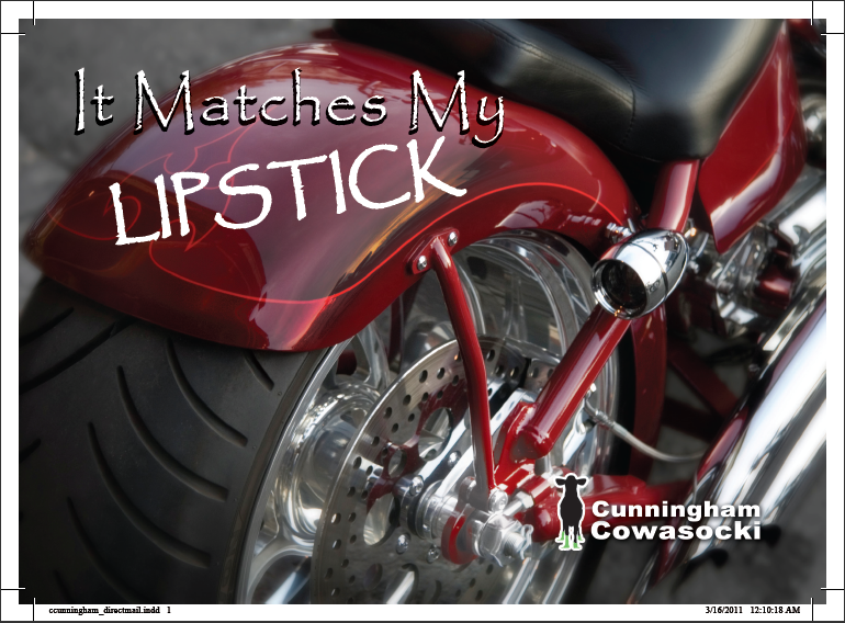
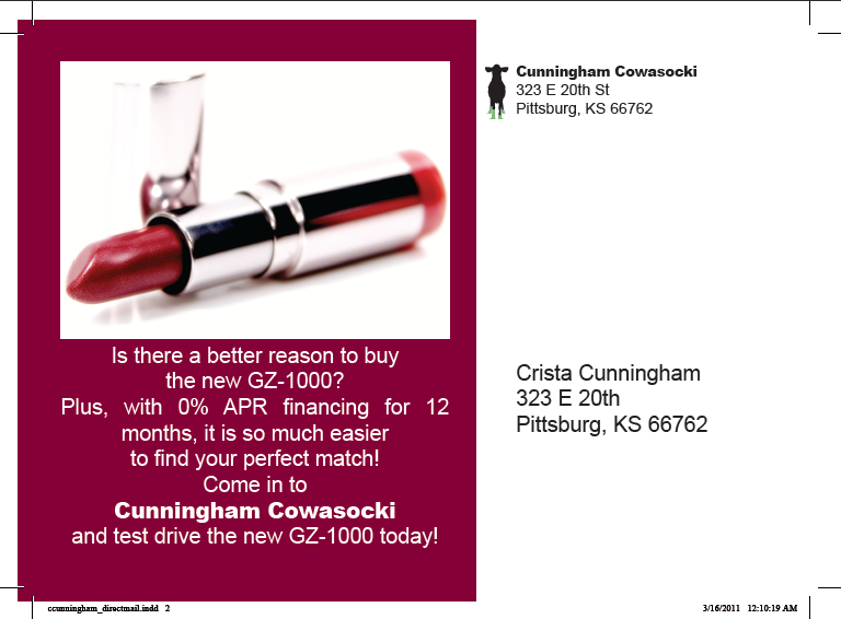
My target audience for this ad would be to men, ages 18+, preparing to pop the question.
The call to action is to invite the reader to the store and offer them a 10% discount by mentioning their ad in the newspaper.
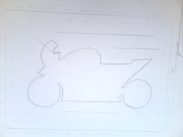
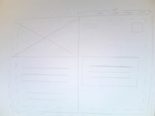
My hand drawn image (shown below) is a drawing of the top of a diamond. This image will be scanned in and converted to a bitmap and placed into my ad.
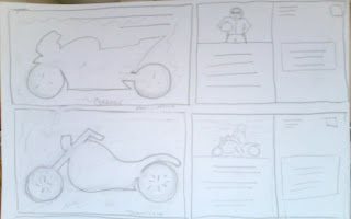
Thumbs

Hand Drawn Image

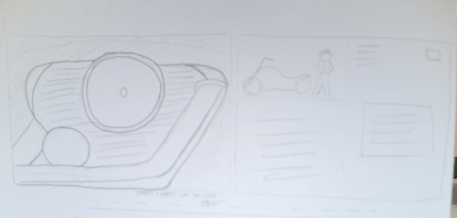
Rough

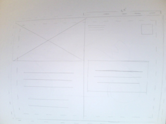
Final

I really enjoyed this project. Having worked for a local phone book company, I found myself in my comfort zone creating this ad. It seemed to take no time at all to come up with a logo that fit the purpose of the piece and an image to complement it. Scanning the image and creating the bitmap to use in the file was time consuming, only because I wasn't doing it myself and I had to rely on others to get it.
I'm happy to be using my new Tag from Microsoft. This is a new style of barcode that is easier on the eyes than the basic black and white QR code. It allows you to not only ad color but change the image inside. I am really excited to implement the full color Tag in my next project.
My only concerns for the ad were wondering if I would lose the reversed words and Tag because of the substrate it would be printed on. I would definately request a proof on newsprint before submitting this ad in any newspaper.