How about a little history lesson since this is the "back to school" season.... I love logos and branding, so here's a brief story about how the Nike logo came to be. Who would have thought a little check mark would become such a world-wide sensation!
http://stocklogos.com/topic/nike-logo-40-years-old

Friday, August 19, 2011
Thursday, August 18, 2011
And the winner is......
Thank you all for your input. I chose logo #1. I am happy with this logo for it's professional feel. I've also created a second style for the logo to use for watermarks and a header for my blog.


Sunday, August 7, 2011
New Logo
After much consideration, I have decided that although I have no aspirations of owning my own design business, I still need to create a label for myself to attach to my work.
This was a huge project for me. Oddly enough, it is so much easier to develop an identity for someone else than it is for yourself. I had to dig deep in the recesses of my brain to create my label. Some people may think that a name or initials will suffice as a logo, but this is far beyond the truth. If your logo doesn't have flare then you might as well start filing for unemployment now. Especially if you're a graphic designer.
My mother (an artist as well) convinced me long ago that "simple is elegant". (Mom, if you are reading my blog in heaven...I WAS LISTENING TO YOU! hahaha ;) ) Obviously, a huge flashy logo was obviously not the choice for me. Honoring her advice, I chose an "elegant" font for the graphic and a "simple" font for my name. I also wanted to pick a color that I would like to look at, so I chose green and brown, and green and black which are my favorite combinations. Green being my favorite color of course. I decided to include my name as well as a graphic to attach it to a design I created, selling myself in a way. Another key factor was to design something that would shrink and enlarge well. Who knows what size I will need to stretch my logo or how small I will need it. And then the last factor in my design was amount of color. I wanted to limit my color for budget purposes. Each color I incorporate would mean more money. But lack of color wouldn't be as eye catching to potential clients.
I created eight different looks to choose from. I'm having a hard time deciding which is my favorite. Currently, my top 4 would be number 1, 3, 4 & 7. I'm proud to announce that my super intelligent 6 year old daughter chose the colors and styles for number 7 & 8. She gets excited when I'm working and likes to give her input. I can't say I'll be too disappointed if she follows in my footsteps. *big dopey grin on my face*.
I hope you enjoy these designs and feel free to vote on your favorite or offer any suggestions.

Friday, July 29, 2011
Photoshop Brush Tutorial
In celebration of my birthday, I've decided to write a tutorial exclusively for my followers! Wait...Shouldn't I get the free tutorial??? Oh well! ;)
I've recently been asked how to create brushes in Photoshop, so here's how it's done...
(Note: this tutorial is for Adobe Photoshop CS4)
1. By using any seletion tool (lasso, marquee, etc.) select the image you desire for your brush tip.

2. Create a new layer.

3. Choose Edit from the Menu Bar and then select “define Brush Preset”.

4. Choose a name for your brush and select ok.

5. Select the brush tool.

6. Click on your new brush tip in your brush pallete and begin to paint.


Enjoy!
Thursday, June 23, 2011
Designer Barcodes!
Designer Barcodes

Check out this link for an article from Yahoo Finance about the cool new designer barcodes. And we thought the Microsoft Tag was cool...
Tuesday, May 10, 2011
Digital File Prep
Digital File Prep
This semester, I have realized the importance of submitting a proper file to our printer. There are many circumstances that can slow or stop a RIP and if one file is not in the correct format, this can slow down the production of your piece possibly causing you to miss your deadline.
I would say that the most important thing I learned to do this semester was creating a folding dummy. My final project was a catalog I created for a cheesecake business. My folding dummy allowed me to see what order I needed to place my files in InDesign. Most people would layout their file in correct page order. But in order to print both sides on each sheet and to fold and staple the pages in the correct order, I had to rearrange my layout.
I also learned that it is important to have a standard check list. Each type of file should have a set resolution, color mode and to check for other elements that may cause an issue with the printer. By checking each file after it's creation, you can be sure that your files will be properly submitted.
It is also important to remember that each file you submit could have different specs. There are no standard sizes. It is extremely important to communicate with the business you are submitting your files to. It is up to the designer to meet their standards, not our own.
As a designer, it is hard to visualize the processes that take place after your job is done. We can't just assume that our files are perfect and as hard as it may be to admit, most issues during printing come from the designer. If the designer takes the time to check the file and submit it properly to the printer, everyone's deadline will be met, meaning happy customers and more business.
Friday, April 22, 2011
Gravure Day - April 21, 2011
Gravure Day 2011
4/21/11
4/21/11
Tracy Hughes
Graphics Dept. Coordinator – Team Joplin
Bemis Packaging – Mill Print Division
Graphics Dept. Coordinator – Team Joplin
Bemis Packaging – Mill Print Division
Bemis in Joplin, MO is dedicated to creating packaging. Bemis currently generates 4.9 billion in sales and has 84 manufacturing facilities and Bemis HQ is located in Osh-Kosh, WI. They currently have 40 customers. Some of their clients include: McCormick, Ore-Ida, Bear Creek, Kool-Aid, Wellness Pet Food, Mothers Cookies, Smucker’s, Heinz and Axe.
Tracy mentioned that at Team Joplin, each employee holds each other accountable. Everyone is offered cross-training and is responsible for everything. Each operator not only knows how to run their machine, but maintain, repair and check quality of their press. Each employee has one rate of pay and is not adjusted for seniority.
Bemis runs gravure printing presses. The benefits of gravure, as opposed to flexography, are quality. With gravure, it is easier to put multiple shades of color on one plate, which is great for higher detail images. Flexography would need a plate for each of those shades. Also, gravure plates are built to last. A roto-gravure plate can run 5 million feet before the plate wears out. A flexo plate will only last for 800,000 feet.
Tracy offered some advice to designers to help us maintain a good working relationship with press operators. Talk to the printers. Printers will see things on the opposite end of the spectrum that designers won’t with our digital printers. If the registration is off, even a small amount, the image will be flawed.
I really enjoy hearing about the other end of printing process. As a designer, it is easy to forget about what others may have to deal with if we don’t know how to properly submit our designs.
____________________________________________________
Jill Dlugopolski – Product Integrity Engineer
Hallmark
Hallmark is a Fortune 100 company and is the world’s largest greeting card company with $4.2 billion in annual sales. They employ 14,600 employees worldwide and have been family owned for over 100 years.
Hallmark is ranked 4th on EquiTrends-Brand Equity list. Other companies include:
1. Craftsman
2. Crayola Crayons & Markers (also owned by Hallmark)
3. Kodak
4. Hallmark
5. Reynolds Wrap
Hallmark is ranked 4th on EquiTrends-Brand Equity list. Other companies include:
1. Craftsman
2. Crayola Crayons & Markers (also owned by Hallmark)
3. Kodak
4. Hallmark
5. Reynolds Wrap
Jill described that her job is the link between the creative department and the printing department. One of her main concerns is checking for product safety, ensuring there is no lead in the ink used in making greeting cards, gift wrap or any other products produced by the company.
Hallmark's printing equipment consists of 6 presses. (2) 7 color, (2) 6 color and (2) five color. They also have a slitter/rewinder, sonic cleaner, chrome stripping tank and a re-chrome tank. The presses are medium web that run paper between 26” and 42” wide. There are 2 presses solely dedicated to the Color Wonder products.
Their gravure print units have a copper base, the image is engraved in the copper and coated in a chrome finish. The ESA (electro static assist)/Rider roller is the impression roller that allows the ink to pull into the paper and ink metering system and several types of doctor blades. This makes for a better transfer of the image to the paper.
Hallmark also operates their own cylinder making equipment. They produce 6200 cylinders a year. Their engraving machine uses an industrial diamond that can engrave 6300 cells per second. This is followed by a chrome bath for coating. The cylinder is then proofed to ensure there are no flaws before shipping. When the job for that cylinder is finished, the cylinder is then de-chromed and the image is removed by polishing and then a grinder/finisher smooth’s the surface to prevent any flaws for the next job. 150 employees work with the gravure equipment.
Hallmark’s recent improvements include now using a water based ink that is friendlier to the environment, using infrared dryers, implementing lean manufacturing, and purchasing equipment for defect detection.
Although Jill isn’t a designer, she was kind enough to talk about the design aspect of the company. The time span of a greeting card from concept to shipping is 6-9 months. Cards for Christmas would print in July. Hallmark has many contracts with other companies such as Disney, Marvel, and Lego. The design team follows a style guide submitted by the companies to ensure the proper use of color themes, images and other elements. Hallmark does design work in house, then ships to print to one of their many printing plants, and then shipped back for finishing. Designers work in different platforms (ages and stages), and are able to rotate departments frequently. They have their own photographers as well as buy stock photos. There are departments for writing and design departments and there is no preference as to whether the image or the content of the card comes first. There is also an entire group dedicated to dealing with innovation and thinking outside the box.
Jill was a fantastic speaker and really explained the processes of gravure well.
____________________________________________________
John Castro – Estimating Manager
Harmony Printing – Liberty, MO
Harmony Printing – Liberty, MO
Liberty Printing was founded 30 years ago and houses 48 employees and has generated $9 million in business. They run heat set web printers that produce magazines, catalogs and direct mail. They have 2 digital presses and a full bindery.
John’s presentation was entitled, “What you may not have learned during your stay here (PSU)”. This presentation was devoted to teaching common sense tactics when entering the work place and claims that by following these tactics, we will be sure to climb the corporate ladder.
He mentioned that no matter what you do, you will always have a boss. Either the client will be your boss, or you will have a boss at whatever facility you work at. His advice is, when interviewing for a job, tell the employer that “you want to work for them…to help them make money”. This tells the employer that you both have a common goal. By helping them make money, you help the company and yourself.
Next, he states that when you’re the boss, you should treat your teammates like gold. Clearly communicate your expectations and always give your employees the tools to succeed. If things go bad, look at yourself first. What didn’t you do to ensure their understanding, and then put yourself in their shoes. He also emphasized on the 3 F’s. Fair, Friendly & Firm. If you follow the 3 F’s you can’t go wrong as a boss.
Communication is essential. Always, be a good listener. Be clear and concise, avoid confusion.
You must learn to work well with others. Teamwork is important in any setting. When you can, always ask what you can do to help. He also listed a few topics to avoid to prevent conflict with teammates such as, personal matters, things that will get you fired, i.e. sexual harassment, and political views.
Always focus on continuous improvement. He tells us to embrace change and always look for a better way to do something, i.e. work smarter, not harder.
He mentions we will at some point be required to give a proposal. A proposal could either be formal such as a business plan or informal such as processes for completing a task. Your proposal should always be factual and accurate and remember that consumers, clients and management focus on one thing….money.
John tells us to embrace our new adventure called “life”. Don’t be afraid to try something new because you can’t turn back the clock.
I agree with most of the points in his lecture. Book smarts are essential but street smarts are vital as well.
Tuesday, April 19, 2011
Final Project
Final Project - Catalog/Booklet
For my final project, I have decided to continue developing the identity for my friend, The Cheesecake Lady. My project will be a 24 page booklet or catalog of each cheesecake flavor, size & price. This will include an outside & inside front cover, several spreads and an inside and outside back cover.
The purpose for this catalog is for the business owner to distribute to her clients and potential clients, so that they may see the variety of flavors she has available and provide the client with information on how to contact her.
The target audience would be males and females, ages 18+, restaurant owners/managers and individuals wanting to order cheesecake.
Printing Specs:
Final booklet size: 8.5" x 11"
.125" bleed - .5" margins
Full color - Full bleed
Sheets will be printed full color, front and back on 11"x17" white paper and folded and stapled in the center
If budget allows, the outside cover paper will be a heavier stock and glossy.

Here is the layout I will be using to make sure the files print in the correct order.
Thumbnails

Roughs

Outside Front Cover

Left hand spread

Right hand spread
Final
This was a challenging project for me, but I loved doing it. I had to do a lot of planning ahead of time to make sure this catalog prints properly. (Which is the soul purpose for this class) Folding dummy's are now my best friend. I would have been so lost trying to figure out which design goes on what page and I'm sure I would have stressed out the people at Printing Services.
There were a lot of photos to implement in this catalog, so I created a few actions in Photoshop to help me size the images properly, convert them to the correct color mode, flatten and save the files in the correct folder. I saved a lot of time this way and I'm confident all of my files are correct.
This catalog is a starting point for my client. Once she receives my proof, we will communicate about implementing the new cheesecake flavors and other items she will want to offer, as well as changes to the design.
The quote I received from Printing Services shows that each booklet will cost about $8. I will be using 1 sheet of 100# coated paper and 4 sheets of 28# paper. It will be printed on 12x18" paper and trimmed down to 11x17", folded and saddle stitched.
Final Images


All Photos taken by The Cheesecake Lady
Background images and Catalog Design by: Crista Cunningham Designs
Microsoft Tag: http://tag.microsoft.com/
QR Code: http://qrcode.kaywa.com/
Facebook Logo: http://www.facebook.com/
Monday, April 18, 2011
125 Years of Coca-Cola
Coca-Cola
Don't worry guys. This is not an assignment or extra credit! ;) I'm getting my "nerd" on!
My favorite thing, dealing in the graphics industry, are logos. I love creating identities and I appreciate their history and value. I hope someday to work in an advertising firm. My dream job would be working for Coca-Cola. I have had a life-long obsession with their branding. (Though, I drink Pepsi...shhh, don't tell ;) )
Coca-Cola is celebrating their 125th anniversary and posted a history of the product and I thought I would share some of it with all of you.
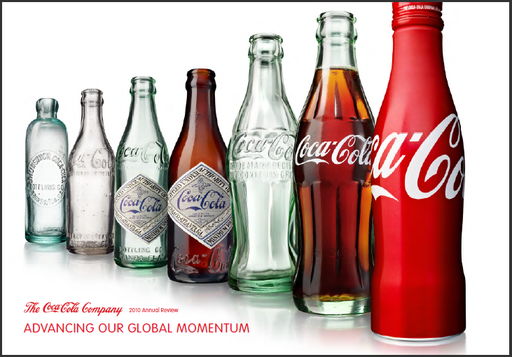
Check out the bottle designs as well as the logo!
Coca-Cola was started in 1886, by a pharmacist from Atlanta named Dr. John S. Pemberton. Yes, I said pharmacist. He created the syrup that gives the drink it's flavor. He took the syrup to another pharmacist where they mixed it with carbonated water and voila. Dr. Pemberton's partner and bookkeeper, Frank M. Robinson was credited for giving Coca-Cola it's name and designing the logo. (I think we can all figure out the origin of the name)
If this interests you, scan the QR code below to go to the Coca-Cola company's website to learn more about their incredible history! Enjoy! (get it? Enjoy! - haha)

Thursday, April 7, 2011
Publication Ad
Publication Ad
This project is our publication ad assignment. We will be creating an advertisement based on the real specifications from a popular magazine. Our assignment was to search for the specs and build a full page, 4 color ad with a full bleed. I chose to make an ad for a friend of mine that owns a bakery. She has never had a logo designed for her business, so I thought we both could benefit from this project. I also plan to use the elements in this advertisement in my final project.
The ad specs for Woman's Day magazine can be found by going to their website http://www.womansday.com/.
My Call to Action for this piece is for the readers of Womans Day magazine to scan the Microsoft Tag to take them to the website.
The target audience would be women, ages 18+, and restaurant owners or managers wanting to purchase cheesecake to supply in their restaurants.


Here are some logo ideas submitted to the business owner.
The "chef hat" and "The Cheesecake Lady" logo was my design.

After communicating with the business owner, she mentioned that she wanted an apron instead of a hat behind the logo. After sketching several different aprons, I couldn't seem to find one that didn't look awkward with the text without changing the entire look of the logo. After searching for different apron vectors on several different stock image sites, I noticed a trend. In most all of the images, there was a woman wearing an apron holding some kind of dessert. That quickly changed my view of how the logo should look. Since she is, after all, "The Cheesecake Lady", I saw no harm in sketching a lady holding cheesecake.The head of the lady is an element from istockphoto.com (I have permission to use this element) and the apron and cheesecake are my designs. I played with several different versions of this theme and once again, submitted them to the business owner. With great enthusiasm, she chose design number 5. This logo is an excellent choice because it will fit well on most substrates, since letterhead, business cards and packaging have square corners. There won't be much need to resize the image to force it to fit in any design.

Final

"The Cheesecake Lady" logo - created by Crista Cunningham Designs
Floral Ornaments submitted by The Cheesecake Lady
Striped background - created by Crista Cunningham Designs
Cheesecake Photo - The Cheesecake Lady
Facebook Logo - facebook.com
Microsoft Tag generated at tag.microsoft.com
Thursday, March 31, 2011
Newspaper Ad
Newspaper Ad
Job Specs:
Ad size- 7.71"x6" - .25" margin - No Bleed - Black and White
Formula:
4 colums wide = 7.71"
4x6" = 24
24 x $4 = $96
InDesign File Size - 7.71" x 6"
This assignment was to create a black and white newspaper ad based on the specifications for The Collegio. We were given column widths to choose from and we were to determine the height of the ad based on our budget of $100.
Columns Inches
1 1.83"
2 3.79"
3 5.75"
4 7.71"
5 9.67"
6 11.63"
I wanted to create a large ad to attempt to grab the attention of the reader before any other ad and also stay within my budget, so I chose to do an ad 4 colums wide and 6" high.
My target audience for this ad would be to men, ages 18+, preparing to pop the question.
The call to action is to invite the reader to the store and offer them a 10% discount by mentioning their ad in the newspaper.
My hand drawn image (shown below) is a drawing of the top of a diamond. This image will be scanned in and converted to a bitmap and placed into my ad.
Thumbs

Hand Drawn Image

Rough

Final

I really enjoyed this project. Having worked for a local phone book company, I found myself in my comfort zone creating this ad. It seemed to take no time at all to come up with a logo that fit the purpose of the piece and an image to complement it. Scanning the image and creating the bitmap to use in the file was time consuming, only because I wasn't doing it myself and I had to rely on others to get it.
I'm happy to be using my new Tag from Microsoft. This is a new style of barcode that is easier on the eyes than the basic black and white QR code. It allows you to not only ad color but change the image inside. I am really excited to implement the full color Tag in my next project.
My only concerns for the ad were wondering if I would lose the reversed words and Tag because of the substrate it would be printed on. I would definately request a proof on newsprint before submitting this ad in any newspaper.
Monday, March 28, 2011
Package Designs
My thoughts on Package Desings
Most companies do their advertising by media such as commercials or print ads, but when a customer is at the grocery store, how do these companies advertise? Packaging. Here are my thoughts on a few package designs and logos.

Wheat Thins
I really enjoy this package design. The bright yellow caught my attention right away. My favorite part is the illustrations of the wheat and how it is breaking out of the cracker. It's fun to look at.

Milk-Bone
If you have a dog, you would notice that Milk-Bone has not changed their packaging for a very long time. They still show the same bone shaped name tag on the back that they have for several years. I think that it's ok to change the package designs at least every few years. Most people are attracted to fun, exciting desings and in my opinion, this is not one of them.

Gain
This is by far, one of my favorite designs. It is fun and whimsical. The design is obviously geared towards women and definately stands out amongst the other brands.

Behr
I was immediately attracted to this brand due to its full color photo. An image like this isn't typically seen on a can of paint. Most brands offer a simple 2 or 3 color design.

Celestial Seasonings
The design on this box of tea is cute and whimsical. It is obvious that the company takes pride in their product to display such an elaborate design on a package that only measures about 5 inches wide.

Great Value
I have never really understood Great Value's packaging re-design. The photos are very small and awquardly placed. I don't like looking at all of the white space. If they were only going to use one color photo, use more colorful photos and make them bigger.
Subscribe to:
Posts (Atom)