
My thoughts on Package Desings
Most companies do their advertising by media such as commercials or print ads, but when a customer is at the grocery store, how do these companies advertise? Packaging. Here are my thoughts on a few package designs and logos.

Wheat Thins
I really enjoy this package design. The bright yellow caught my attention right away. My favorite part is the illustrations of the wheat and how it is breaking out of the cracker. It's fun to look at.

Milk-Bone
If you have a dog, you would notice that Milk-Bone has not changed their packaging for a very long time. They still show the same bone shaped name tag on the back that they have for several years. I think that it's ok to change the package designs at least every few years. Most people are attracted to fun, exciting desings and in my opinion, this is not one of them.
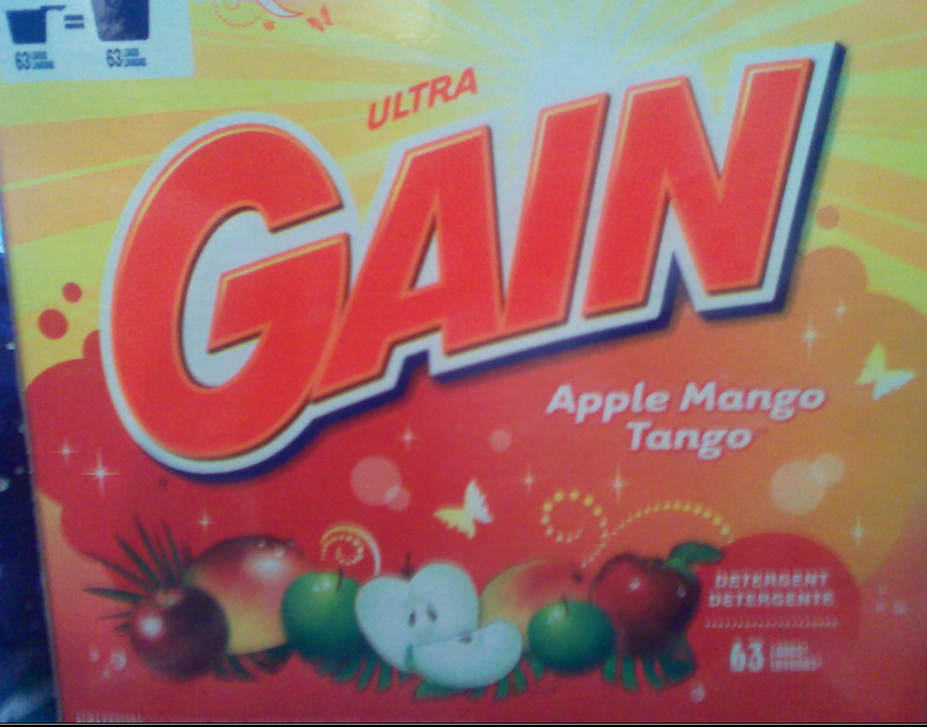
Gain
This is by far, one of my favorite designs. It is fun and whimsical. The design is obviously geared towards women and definately stands out amongst the other brands.

Behr
I was immediately attracted to this brand due to its full color photo. An image like this isn't typically seen on a can of paint. Most brands offer a simple 2 or 3 color design.

Celestial Seasonings
The design on this box of tea is cute and whimsical. It is obvious that the company takes pride in their product to display such an elaborate design on a package that only measures about 5 inches wide.

Great Value
I have never really understood Great Value's packaging re-design. The photos are very small and awquardly placed. I don't like looking at all of the white space. If they were only going to use one color photo, use more colorful photos and make them bigger.
No comments:
Post a Comment